
TABLE OF CONTENTS :
WAS MY LOS ANGELES NEIGHBORHOOD REDLINED? A Detailed Look at Los Angeles' 1939 HOLC Maps.6/30/2020 WAS MY LOS ANGELES NEIGHBORHOOD REDLINED? A Detailed Look at Los Angeles' 1939 HOLC Maps by Damian Gatto Always an enthusiast of United States Presidential history, I never quite understood why Franklin Roosevelt is remembered as such a progressive president. On top of his economic statism and the internment of 130,000 law-abiding citizens (127,000 Japanese and thousands of Italians and Germans) during his presidency, Roosevelt signed the National Housing Act of 1934 into law, which in-turn authorized the creation of the Federal Housing Administration. The FHA sponsored a private firm called the Homeowners' Loan Corporation (HOLC), charging them with the creation of a system that would guide the government in distributing aid to prevent foreclosures across the country. As a visual aid, the HOLC produced "residential security maps" indicating their assessment of real-estate stability in 239 U.S. cities, now referred to in the shorthand as "redlining maps" or "HOLC maps." The maps were overlaid with a four-color gradient indicating different levels of investment stability. From highest to lowest, these colors were: Green - "Best" Blue - "Desirable" Yellow - "In-Decline" Red - "Hazardous" One peculiar thing about the 1939 HOLC maps is that some of the criteria used to assess investment risks are fairly common in real estate, while other criteria are virulently racist, classist, and xenophobic. On the one hand, these color grades relied on some fairly typical real estate assessment criteria, such as: - Intrusion of industry or other noxious land uses, or proximity to those land uses - Mixed adjacent land uses, in general - Age of the community's housing stock - Rate of growth - Presence of multi-family housing of any amount, size, or kind (even a compact duplex) - Presence of nondescript architectural styles - Quality of construction - Availability and profusion of amenities (such as shops, transportation, attractions) - Availability or lack of infrastructure (such as sewers, electricity, hydrants) However, redlining maps are most discussed within modern social sciences disciplines for their use of race, class, religion, and country of origin as criteria for determining the security of real estate investments in many communities. In a country that was, at the time, largely biracial (at 89% White and 9% Black) and comprised of two or three disparate income categories, the consideration of race and class basically meant that a community's high percentages of Black and/or low-income residents were enough for the HOLC to assign a negative color grade. It is for these reasons that the HOLC are regarded as the pioneers of racial redlining. The term "redline" has also found its way into the vernacular more broadly to mean "set apart as hazardous or undesirable." In Los Angeles and other cities along the West Coast, HOLC contractors ran into a slight challenge. The HOLC contractors seemed to have only come expecting to assess "White-versus-Black" makeups of an area, being that the Area Description sheets only contained a line reading "Percentage Negro." However, cities like Los Angeles, San Fransisco, and New York were not so ethnically homogenous or dichotomous as many other places in the country. As such, the HOLC contractors wrote in many of the other ethnic and religious groups they encountered. Was MY Los Angeles Community Redlined? The short answer is, it is very likely that your Los Angeles County community was redlined (meaning that issuing loans in such a neighborhood was "hazardous") or given an assessment of yellow (meaning that the community was "definitely in decline"). The HOLC came through Los Angeles County and turned the cartography of the city into a Jackson Pollock mural. 22% of the city was redlined, 46% was yellowlined, 20% was bluelined, and 12% was greenlined. In other words, over two-thirds of the County of Los Angeles--68%, to be exact--was no bueno in the eyes of the HOLC. Redlined communities could even be found right next to greenlined ones--and in some places, the effects of these disparate assessments are still visible today. Below: Macro-level HOLC Residential Security Map of Los Angeles County, covering the Westside, Mid-City, Hollywood, South Central, East LA, Northeast LA, and some of the Gateway Cities. (Source: University of Richmond) 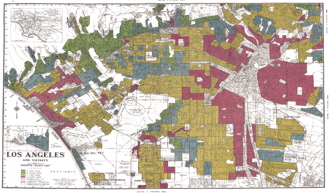 Most academic sources reproduce the raw map itself--which is great--but I decided to generate my own renditions of the HOLC maps, overlaid with current Los Angeles neighborhood boundaries. (Although there aren't official, administrative boundaries of LA 'hoods --just "agreed-upon" boundaries-- these imagined boundaries are what many Angelenos swear by and thus act as a more useful point of reference than the much more arbitrary lines drawn by the HOLC). Many published sources also fail to go into detail about geographic boundaries like streets or hills. Many sources also fail to mention the area description sheets attached to each area, listing the HOLC surveyor's "rationale" for their grades. I thus decided generate my own maps as a means to take a detailed look into how different communities in our city have been afflicted (or unscathed) by the 1939 HOLC map grades. I generated my renditions of the HOLC maps using the QGIS platform, and shapefiles for "Los Angeles Times Neighborhood Boundaries" and "1939 HOLC Redlining Areas" as my data. These are available via geohub.lacity.org and hub.arcgis.com . CLICK "READ MORE" BELOW
to turn the page and find out why your Los Angeles neighborhood was (or was not) redlined!
2 Comments
|
Archives
December 2022
Categories
All
|
 RSS Feed
