
TABLE OF CONTENTS :
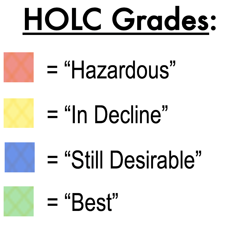
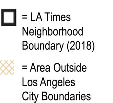
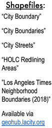
WAS MY LOS ANGELES NEIGHBORHOOD REDLINED? A Detailed Look at Los Angeles' 1939 HOLC Maps.6/30/2020 WAS MY LOS ANGELES NEIGHBORHOOD REDLINED? A Detailed Look at Los Angeles' 1939 HOLC Maps by Damian Gatto Always an enthusiast of United States Presidential history, I never quite understood why Franklin Roosevelt is remembered as such a progressive president. On top of his economic statism and the internment of 130,000 law-abiding citizens (127,000 Japanese and thousands of Italians and Germans) during his presidency, Roosevelt signed the National Housing Act of 1934 into law, which in-turn authorized the creation of the Federal Housing Administration. The FHA sponsored a private firm called the Homeowners' Loan Corporation (HOLC), charging them with the creation of a system that would guide the government in distributing aid to prevent foreclosures across the country. As a visual aid, the HOLC produced "residential security maps" indicating their assessment of real-estate stability in 239 U.S. cities, now referred to in the shorthand as "redlining maps" or "HOLC maps." The maps were overlaid with a four-color gradient indicating different levels of investment stability. From highest to lowest, these colors were: Green - "Best" Blue - "Desirable" Yellow - "In-Decline" Red - "Hazardous" One peculiar thing about the 1939 HOLC maps is that some of the criteria used to assess investment risks are fairly common in real estate, while other criteria are virulently racist, classist, and xenophobic. On the one hand, these color grades relied on some fairly typical real estate assessment criteria, such as: - Intrusion of industry or other noxious land uses, or proximity to those land uses - Mixed adjacent land uses, in general - Age of the community's housing stock - Rate of growth - Presence of multi-family housing of any amount, size, or kind (even a compact duplex) - Presence of nondescript architectural styles - Quality of construction - Availability and profusion of amenities (such as shops, transportation, attractions) - Availability or lack of infrastructure (such as sewers, electricity, hydrants) However, redlining maps are most discussed within modern social sciences disciplines for their use of race, class, religion, and country of origin as criteria for determining the security of real estate investments in many communities. In a country that was, at the time, largely biracial (at 89% White and 9% Black) and comprised of two or three disparate income categories, the consideration of race and class basically meant that a community's high percentages of Black and/or low-income residents were enough for the HOLC to assign a negative color grade. It is for these reasons that the HOLC are regarded as the pioneers of racial redlining. The term "redline" has also found its way into the vernacular more broadly to mean "set apart as hazardous or undesirable." In Los Angeles and other cities along the West Coast, HOLC contractors ran into a slight challenge. The HOLC contractors seemed to have only come expecting to assess "White-versus-Black" makeups of an area, being that the Area Description sheets only contained a line reading "Percentage Negro." However, cities like Los Angeles, San Fransisco, and New York were not so ethnically homogenous or dichotomous as many other places in the country. As such, the HOLC contractors wrote in many of the other ethnic and religious groups they encountered. Was MY Los Angeles Community Redlined? The short answer is, it is very likely that your Los Angeles County community was redlined (meaning that issuing loans in such a neighborhood was "hazardous") or given an assessment of yellow (meaning that the community was "definitely in decline"). The HOLC came through Los Angeles County and turned the cartography of the city into a Jackson Pollock mural. 22% of the city was redlined, 46% was yellowlined, 20% was bluelined, and 12% was greenlined. In other words, over two-thirds of the County of Los Angeles--68%, to be exact--was no bueno in the eyes of the HOLC. Redlined communities could even be found right next to greenlined ones--and in some places, the effects of these disparate assessments are still visible today. Below: Macro-level HOLC Residential Security Map of Los Angeles County, covering the Westside, Mid-City, Hollywood, South Central, East LA, Northeast LA, and some of the Gateway Cities. (Source: University of Richmond) 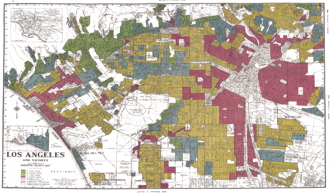 Most academic sources reproduce the raw map itself--which is great--but I decided to generate my own renditions of the HOLC maps, overlaid with current Los Angeles neighborhood boundaries. (Although there aren't official, administrative boundaries of LA 'hoods --just "agreed-upon" boundaries-- these imagined boundaries are what many Angelenos swear by and thus act as a more useful point of reference than the much more arbitrary lines drawn by the HOLC). Many published sources also fail to go into detail about geographic boundaries like streets or hills. Many sources also fail to mention the area description sheets attached to each area, listing the HOLC surveyor's "rationale" for their grades. I thus decided generate my own maps as a means to take a detailed look into how different communities in our city have been afflicted (or unscathed) by the 1939 HOLC map grades. I generated my renditions of the HOLC maps using the QGIS platform, and shapefiles for "Los Angeles Times Neighborhood Boundaries" and "1939 HOLC Redlining Areas" as my data. These are available via geohub.lacity.org and hub.arcgis.com . CLICK "READ MORE" BELOW to turn the page and find out why your Los Angeles neighborhood was (or was not) redlined!
You can right-click and enlarge each map in a separate browser window or tab. You will also notice that only Los Angeles city proper has street layout data. Sorry, but loading the line data of the streetscape for every LA County city would cause LONG load times with my particular machine. 1. The Los Angeles Region At-Large and 2. LA between the Hollywood Hills and Slauson Avenue 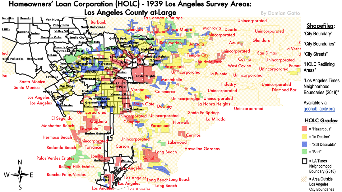 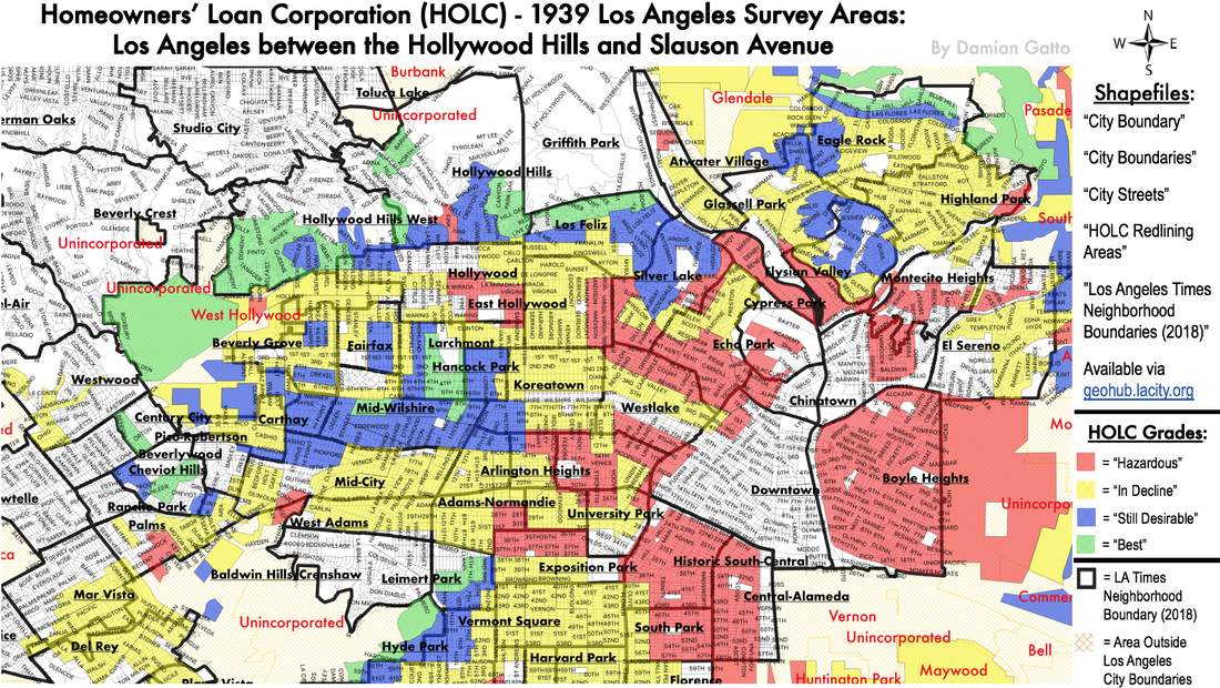 These first two broad selections of Los Angeles illustrate how the 1939 HOLC maps redrew Los Angeles into a checkered cartographic mess. Neighborhoods assessed with "low" grades often directly neighbor neighborhoods with "high" grades. For example, Fremont Place, Larchmont, and Windsor Square, which were greenlined, are now surrounded by more working-class areas like Hollywood, East Hollywood, and Westlake, which were redlined and yellowlined. 3. Downtown, Eastside, Hollywood, Northeast LA, Westlake, and Wilshire Center and 4. Northeast LA, the San Gabriel Valley, Glendale, and La Cañada 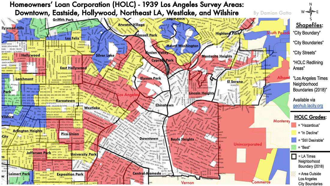 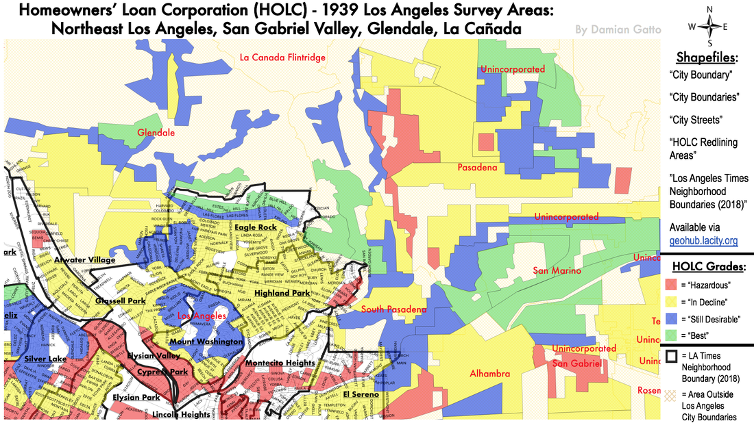 Map #3 depicts Hollywood, Central LA, Wilshire, the Eastside, and Northeast LA. You will note that fewer than two dozen districts north of Slauson Avenue were graded blue (desireable) or green (best). Highland Park, where I was raised, was yellowlined. Interestingly, in 1939, Highland Park was still mostly White, but the HOLC maps still gave the neighborhood low marks for its high percentage of retired persons, renters, and old housing stock. In all of Northeast Los Angeles, only Mount Washington is bluelined. The northern part of Eagle Rock, along Hill Drive, is greenlined. And wouldn't you know it--Mount Washington and Hill Drive are some of the only parts of Northeast Los Angeles that reasonably maintained their property values and high socioeconomic status throughout the years. In Map #4, note the contrasts between the industrial south side of Glendale (yellowlined and redlined) and the northern/eastern communities like Glenoaks Canyon (bluelined and greenlined). And look, La Crescenta is yellowlined, while La Canada is mostly bluelined! La Canada has maintained its high socioeconomic status, while La Crescenta is mixed income. 5. South Central Los Angeles (Bound by I-10, Baldwin Hills, Alameda Street, and 120th Street) 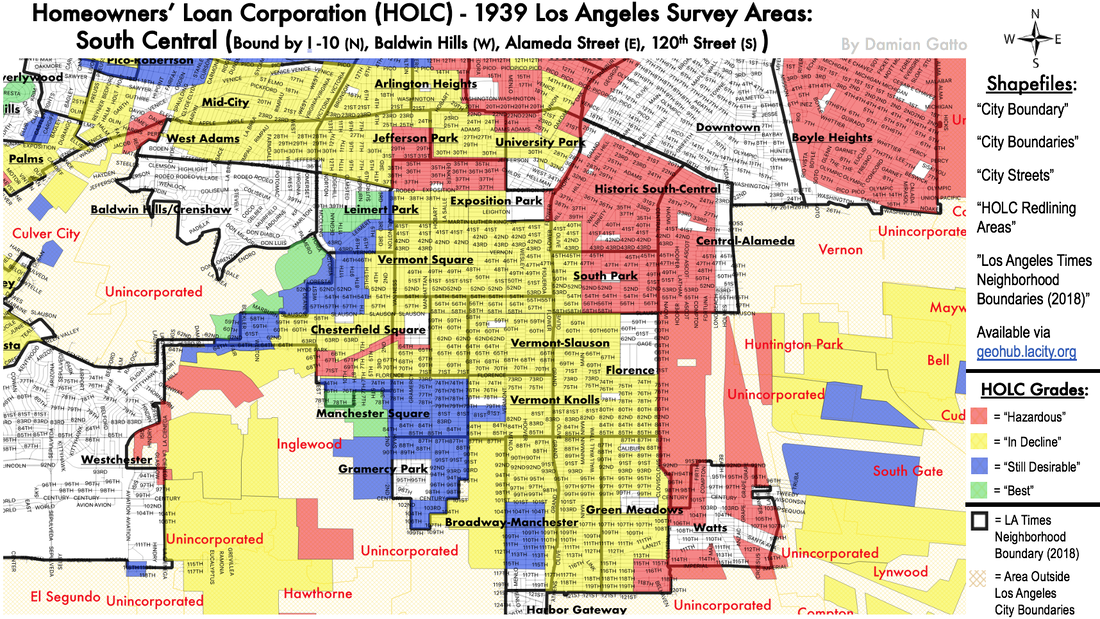 In the debate over the long-term socioeconomic effects of redlining, these maps of South Central and Southeast Los Angeles County are very revealing. Nearly all of the area south of Washington Boulevard is redlined or yellowlined. The Historic East Side of South Central, which I am enamored with and have written extensively about, was entirely redlined. The so-called "Florence Industrial District" was given the "most medial" of red grades because of the intrusion of industry and the presence of "Mexicans [...] Negroes [...] and low-class Italians." West Adams and the historic parts of the western side of South Central are yellow lined. Again, this was a community that in 1939 was mostly White, and the index card for the West Adams district even notes how it was "once one of the most upscale areas of the city" but its aging housing stock and increasing presence of Japanese and Black folks were enough to earn the area a lower grade. The index card also notes how the area had ostensibly lost desirability because of nearby development, which ruined its rural character. Jefferson Park is yellow and redlined due to their being “increasingly common communities of Japs and Poles,” and home to “minor executives” and “working professionals.” ~ The only parts of South Central that are blue or greenlined are Baldwin Hills, Leimert Park, Manchester Square, Gramercy Park, unincorporated Westmont, and [most of] Inglewood. Baldwin Hills was the hot new hillside development at the time. Leimert Park and Inglewood were also brand new and full of development opportunities, as were the peripheral Manchester Square, Westmont, and Gramercy Park areas. These six communities are rare exceptions to the seemingly binding spell of the 1939 HOLC maps. While blue and greenlined communities in the 1939 HOLC maps of Los Angeles tended to stay upscale into the 21st century, these six areas actually declined as time wore on, with Inglewood entering a decades-long crime wave beginning in the 1970s, and Westmont remaining one of the highest violent crime areas in Los Angeles County. This represents a rare exception with regard to the HOLC's color grade of a community and their present socioeconomic state. In this case, the HOLC gave the communities of Inglewood, Westmont, Manchester Square, and Gramercy Park high assessments in 1939, but would later experience socio-economic decline. 6. Southeast Los Angeles County 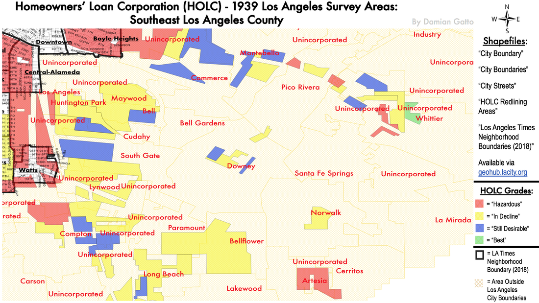 Moving to Southeast Los Angeles County, we can observe how in the years following their red and yellowlinings, communities and cities went on to become some of the lowest income and highest minority-predominant areas in the whole county. Maywood, Huntington Park, and Bell, each currently between 92-96.5% Latino, were all yellowlined. (To the north, Boyle Heights and East Los Angeles, largely redlined in 1939, are currently 94-96% Latino.) Southeast Los Angeles County is also presently one of the most afflicted areas in the County in terms of violent crime, high teacher-to-student ratios, median household incomes, and industrial pollution. 7. The "Shoestring" Annexation and Vicinity 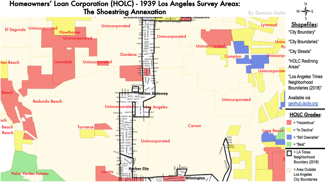 The "Shoestring Annexation" was an annexation made by the City of Los Angeles in August 1909 when it annexed its ports of San Pedro and Wilmington. The two communities, once their own independent townships, were both 25 miles from Downtown Los Angeles. There were some small settlements located along the way, namely some of the first houses of present-day Gardena. Most of the communities in the "Shoestring" were redlined. 8. The Westside 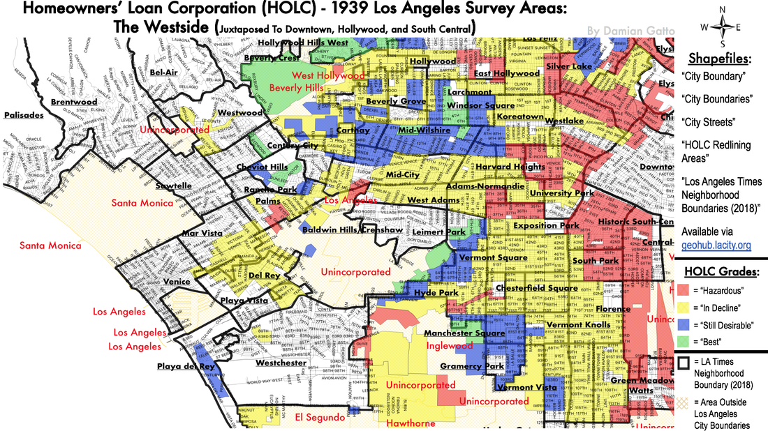 The communities that did manage to escape redlining and yellowlining were mainly relegated to the western edge of the city: Larchmont Village, Fremont Place, Fairfax, Windsor Square, Hollywood Hills, and the independent City of Beverly Hills. Indeed, at present, the 405 freeway is a de facto divider between the Westside and the Central City, and it is almost as if the 405 Freeway was laid down with respects to the grades assigned by HOLC to these neighborhoods. With some exceptions, most of the neighborhoods west of La Brea Avenue and along Beverly Boulevard were green and bluelined. Correspondingly, many of these same neighborhoods did not experience the same post-War decline that the neighborhoods east of La Brea did. There are also noticeable contrasts among the communities bordering Western Avenue, a main thoroughfare that HOLC surveyors seemed to use to as a prominent dividing line. In the 1939 maps, Western and Fountain Avenues seemed to separate the “hazardous” from the “declining” parts of Hollywood. Indeed, to this day, the area of Hollywood south of Fountain and west of Western is the lowest-income and highest-percentage immigrant sections of Hollywood. The intersection of Beverly and Western, similarly, seemed to be WOLC’s dividing line for the “good” and “bad” parts of the central city. At present, Western Avenue and Wilton Place at their intersections with Beverly Boulevard display strong contrasts with regard to housing stock and residential demographics. The effect of the 1939 HOLC redlining maps in this area is evident in the immediate vicinity of Beverly Boulevard and Western Avenue. 1st Street and Western Avenue is a neighborhood with low average incomes, high-percentage minority populations, high incidences of crime, and very dense living conditions. The intersection of 1st and Wilton Place, despite being just a few blocks west, is an affluent neighborhood bordering Hancock Park, with large, well- preserved Craftsman and Colonial homes that ask over $1.5 million. Two tiny, lone sections of West Hollywood (then called "Sherman") are given low grades, a stark contrast when juxtaposed to the rest of the Westside. The vicinity around Dick Street north of Santa Monica Boulevard, called the "Norma Triangle," was redlined due to its high concentrations of "WPA workers [...] Railroad workers [...] Negroes [...] and Mexicans." A similar assessment was given to the vicinity of Melrose and San Vicente Boulevard, also home to many WPA and railroad workers. Wow, FDR Administration. Way to create an agency for struggling workers, and then shame them for it when you assess their communities. Just.....all kinds of wow. 9. The South Bay and the Gateway Cities 10. The Beachside Communities and 11. Long Beach 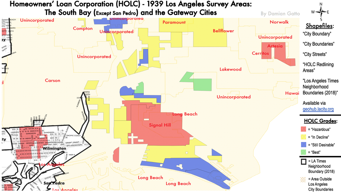 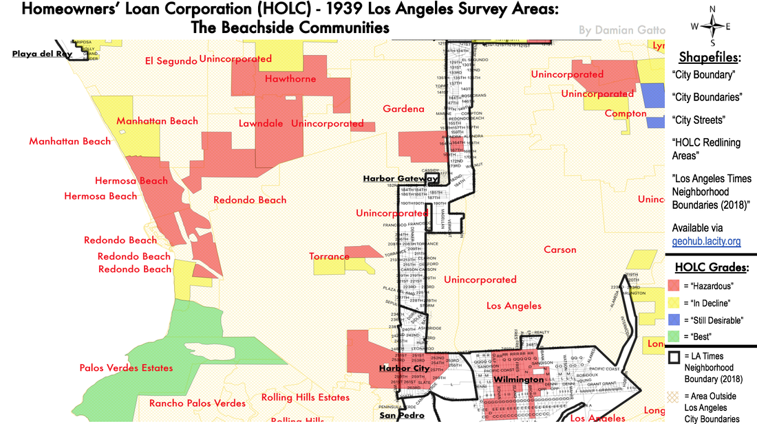 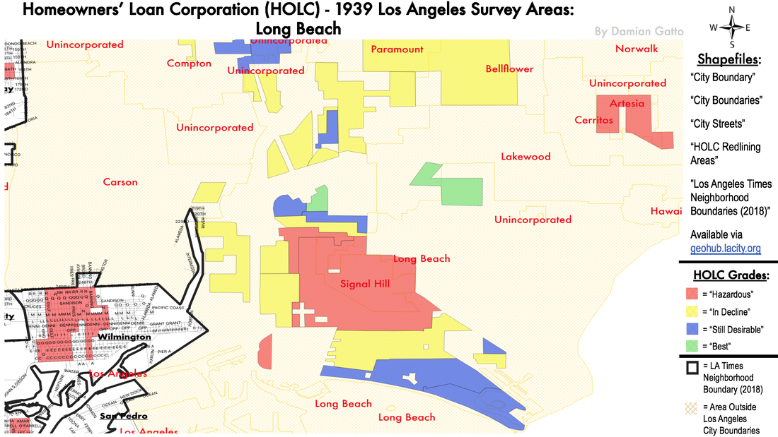 The port communities of San Pedro and Wilmington, once their own townships, were annexed to the City of Los Angeles on the very same day in August of 1909. Most of San Pedro, a working class community, was yellow and redlined. Only the southern portion of the district was afforded higher grades. Wilmington, always known as a working class community, was redlined. Moving over to the South Bay's beachside communities, we see some other notable exceptions to the lasting legacy of negative HOLC grades. Redondo Beach, Manhattan Beach, and Hermosa Beach, while redlined and yellowlined in the 1939 HOLC maps, are presently quite upscale communities with high property values. This represents another rare exception with regard to the HOLC's color grade of a community and their present socioeconomic state. In this case, the HOLC gave the communities of Redondo Beach, Manhattan Beach, and Hermosa Beach low assessments, but these communities would later experience tremendous economic growth. This is an inverse effect of the cases of Westmont, Manchester Square, Gramercy Park, and the City of Inglewood, which were given high assessments by the HOLC, but later experienced sharp socio-economic decline. 1939 HOLC Redlining Areas vs. Present-day Low-Income Areas in Los Angeles Below is the roughly the same selection of Los Angeles at-large as Map 2, with color coding corresponding to an axis of increasing and decreasing a) median household incomes and b) percentage minority population. In the HOLC maps, there is a near-overlap of districts that were redlined or yellowlined in 1939, with districts containing high-percentage-minority and low-median- income populations today. I did not create the map below. The source for this particular map is: https://www.arcgis.com/apps/MapSeries/index.html?appid=2a9f34991c5f4e899d217827139eb9a4 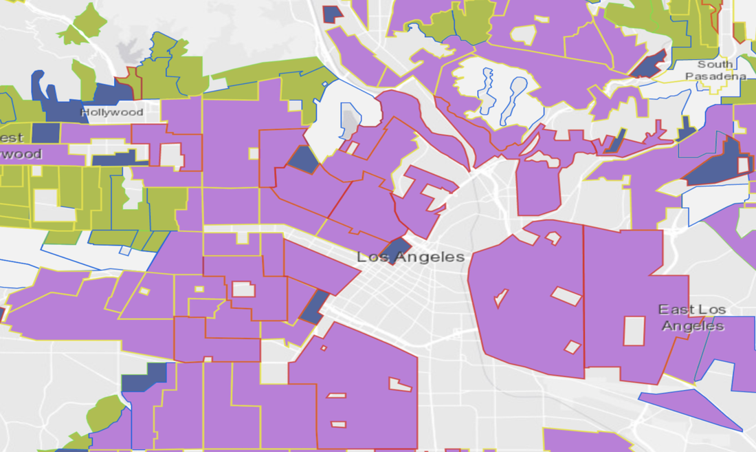 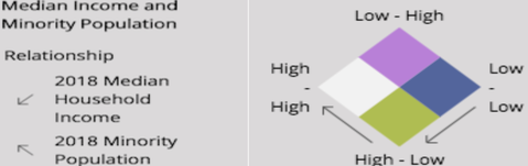 You Get the Picture. So.... Do the 1939 HOLC Residential Security Maps of Los Angeles ultimately affect the socio-economic state of the same communities today? There has been a great deal of debate in academic and other circles about how the HOLC's Residential Security Maps affect the current socio-economic state of the communities they assessed. Certainly, the vast majority of Los Angeles communities that were red and yellowlined in 1939 seemed to have fallen into a trap created by the federal government, whereby the ostracization of and subsequent disinvestment in these communities only augmented their socio-economic woes. However, there are notable exceptions in the case of Los Angeles County, whereby areas that the HOLC red and yellowlined went on to become thriving communities with high socio-economic stature, whilst some of those who were given green and blue ratings went on to experience severe decline. On the one hand, the HOLC gave the communities of Inglewood, Westmont, Manchester Square, and Gramercy Park high assessments in 1939, but would later experience socio-economic decline. On the other hand, the HOLC gave the communities of Redondo Beach, Manhattan Beach, and Hermosa Beach low assessments, but these communities would later experience tremendous economic growth. This is an inverse effect of the cases of Westmont, Manchester Square, Gramercy Park, and the City of Inglewood, which were given high assessments by the HOLC, but later experienced sharp socio-economic decline. What are the reasons for these deviations? It is difficult to say; it may be a complex combination of past and present traits. I am working on archiving all of the index cards for each of the HOLC areas, which contain the "rationale" (as if racism or classism has "rationale") for each of the grades assigned to each area. They are deeply revealing documents, replete with racist and classist language.
2 Comments
ssorbom
9/5/2020 12:05:34 pm
Boy, did they get Torrance wrong! In fairness, it was mostly cow pastures prior to 1950, and they had no Idea beachfront would be a hot commodity soon. Interesting map. 1/21/2023 02:46:56 pm
Hello ssorbom, Leave a Reply. |
Archives
December 2022
Categories
All
|
 RSS Feed
